© Alexander Khom
PROJECT DETAILS:
KNOW MORE ABOUT THE DESIGNERS:
The flagship coffee house of the large Coffee Machine chain, located in the historic center of the city. This cafe and bakery became their first major street retail project. In this project, it was necessary to cover various shopping scenarios — one can get coffee on their way to work in the morning, have a snack or hold a working meeting in the afternoon, and meet friends in the evening. In addition, it was necessary to focus on the bakery, as well as make the cafe visually visible from the street.
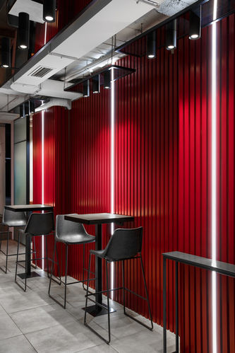
There was also a task to reflect the elements of the corporate identity of the company so that this network could be recognized. The cafe is narrow and long, and its entrance is a transit area — there is a staircase leading to the second floor, where other institutions are located. It was necessary to provide convenience for both guests of the coffee shop and visitors of the second floor. As a result, a quick service area was located in the hall at the entrance, where visitors can take coffee with them and also have a quick bite at compact high tables.
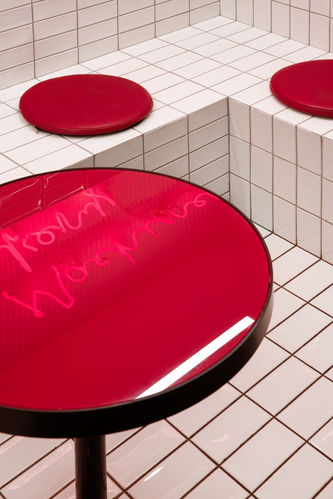
The main accent materials in this zone were copper and steel, the color of which is associated with the warmth of baking. To obtain the desired color of the steel panels, they were processed with a specific chemical composition and baked in an oven. It also housed a monumental bar, decorated with concrete panels in terrazzo style. The contrasting panel pattern was created specifically for this project and was laid out by us manually in the process of their production. The use of all these techniques has helped to make the interior more expressive when viewed through windows from the street. Under the stairs, we managed to create a special zone using glossy tiles in the Japanese style.
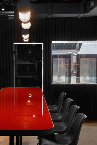
This area is more visually attractive than functional, so it has become the most photographed by visitors. There is an open bakery in the back of the room behind the glass, which is clearly visible from the entrance area. Due to the difference in height, it seems like the bakery stands on stage.
A white bakery and a darkened room are separated by a wall with black volumetric panels, and thanks to the resulting contrast, everything that happens in the kitchen looks more dramatic and interesting. The original brick has been preserved in this zone. The use of darker shades of decoration and spotlighting helped us create a more intimate area with various types of seats, so it could accommodate large and small groups of visitors. Burgundy, the corporate color of this cafe chain, became the connecting element of the whole interior. It determined the choice of color for wall panels, chair and countertop drapery.
We also developed special branding elements for this project. A neon sign was designed and manufactured for the photozone under the stairs, and a lightbox with a pattern repeating the pattern of concrete panels was placed on the facade of the building. This coffee shop accommodate different conditions to satisfy various requests from its visitors. A variety of seats, moods and textures solves the assigned design tasks, and also creates a complex interior, which remains visually simple at the same time. One can stay here both in a dynamic and in a relaxed atmosphere. And get different emotions, of course.
GALLERY:


