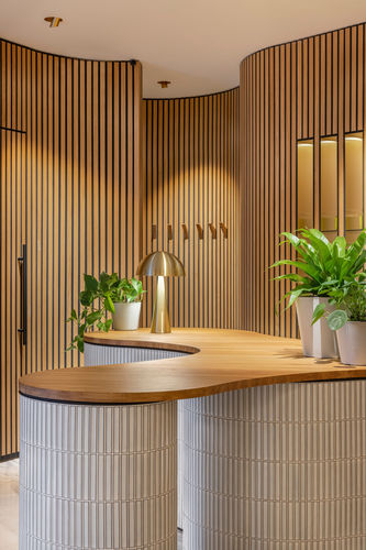
© oikoa massage boutique is open | concrete
PROJECT DETAILS:
KNOW MORE ABOUT THE DESIGNERS:
Oikoa, a new massage boutique in Zwolle (in the east of the Netherlands), has opened its doors. Concrete designed the interior and the graphic identity, and the name Oikoa is all about inner self and wellbeing.
Oikoa, the Finnish word for ‘smooth correction, provides an introverted realm of calm. A place that invites you to leave the outer world behind, and to recharge in a natural and harmonious environment.
The massage boutique is designed as a serene space where guests can focus on themselves. This was achieved by turning the existing extroverted glass cube inside out and placing the organic-shaped central space at the heart of the building, with the treatment rooms situated on the perimeter.
Guests enter directly into the core of the boutique; a warm introspective space lined with multiple curved walls, finished in warm oak laths. The curved walls create intimate seating areas, with softly curved benches upholstered in moss green velvet. These are the perfect spots to wait in full comfort and prepare for treatment.
In addition to the interior, concrete is responsible for the identity of Oikoa, including the name, logo, website, and all print materials.
concrete also came up with the name Oikoa, the Finnish word for ‘smooth correction’, based on the feeling of calm one gets after a treatment when the body is untangled and almost feels ‘liquid’. This feeling is reflected in the logo: a liquid oil drop combined with a minimalistic but elegant font. Bright white backdrops and pine green emphasize the natural and harmonious environment of the massage salon, which is further enhanced by a secondary colour family of oil drops. Both the oils and colours are derived from Finnish natural elements such as ferns, aspen trees, cloudberries, and bellflowers.
GALLERY:


